Showing posts with label Apple. Show all posts

Wednesday, July 4, 2012

“Apple, Customer Service; Customer Service…”

Apple’s MobileMe services, including the various web hosting services associated with homepage.[mac|me].com were shutdown at the start of this month. Apple, a company that has built data centers the size of small towns to support its iCloud Internet services, appears not to have been able to find any resources to keep its existing Internet services going (even after spending years integrating “dot mac”/“Mobile Me” publishing into their various content production/manipulation apps). In the lead-up to shutting down their web hosting service, they were also incapable of providing customers with support for a service as fundamental as setting-up HTTP 303 permanent redirects, so that users’ browsers and search engine crawlers, alike, could be told where all those displaced web pages had gone to.

Apple’s best advice was “associate a custom domain with your homepage well in advance, then change where that domain points at the switchover.” A sound approach as far as it goes (it does nothing to address the loss of some features dot mac customers have been accustomed to for many years), but “dot mac”/”Mobile Me” was supposed to be web hosting for the rest of us – and I think that’s a bit much for many of the “rest of us,” especially if you’ve taken a fresh-eyed look at the home pages of the various domain registrars and web hosting companies – they’re an undifferentiated hell of “do this,” “do that” advertisements for their own mess of conflated/conjoined services. And some of the user experiences behind those sign-up buttons stop me cold, even when they don’t appear to lead into a trap or scam … and I’m one of the people who knows what they’re doing, at least in principle. (Figuring out how to just get services A and B out of companies intent on selling you the world and/or the Brooklyn Bridge is another matter.)

So, Apple’s paying customers are cutoff (if that’s how they’ve decided to treat their paying customers…), chucked out of the confines of the walled garden of dot mac, and granted their freedom in the middle of an unmapped swamp stretching from horizon to horizon. A review of basic customer service principles, and a reading of The Paradox of Choice, seems overdue in Cupertino. Better late than never.

(Sure, lots of companies do worse to their customers everyday, and I feel no need to criticize them for two reasons: in most cases I don’t even know about those incidents, and that’s because I select companies like Apple to deal with … firms that repay any extra up-front costs with the quality of their products or services in the long run. You know … usually … in principle. Which reminds me: Hey, Apple, Mac OS X 10.7 still doesn’t support your own RAID drivers! Screw your Pro users. Maximize the disk I/O performance bottleneck. WTF?)

Friday, April 13, 2012

Owl Status Report

A few people have asked for a status report. The owls and eggs are fine.

There. I hope you’re happy.

Expanding on that a little, we’re in the long, dull ~30 day incubation period. All four eggs look good (there’s been no opportunity to weigh or measure the last two, regretably). Mme. Owl is comfortable and, due to mild temperatures, can leave the box with some regularity, albeit not for long periods of time. Mr. Owl has been providing a steady supply of small food items ranging from geckos to cockroaches.

Ranting, with a Hint of Techno Status

So, everything is exactly as it should be, apart from the fact that there is no screech owl cam’, which is driving me nuts. I started with at least a plan A, B and C to make this happen, one way or the other. But every one of those plans has either failed, or is being delayed very effectively by the people who should be supporting their company’s customers, and do, it seems, right up to the point where a solution could result. If this persists much longer, I may find the energy to write a review of a company which we’ll just call SS for the moment, the defective product they sold me, but won't quite arrange to replace, and the smart, hard working technical support person I've been dealing with there, who nonetheless answers email maybe once a week (or not all) and phone calls even less often.

There was a plan D, too, which was to render the absence of the traditional cam’ pages more-or-less irrelevant, by offering streaming audio/video, instead. It appears that streaming video is a no-go. The solid offer to stream the video from campus that I had has failed to be realized. The commercial service USTREAM turns out not support any streaming audio/video standards. I mean real IETF standards, like my video server supports (RTSP/RTP in this case), not the things companies call standards because that sounds better than "some damn fool thing, created in secret with no danger of peer review, that we want you to use".

So, now I'm back to plan A, which I don’t like (especially now that I know how it behaves in practice – it was much better in theory), but which I’m getting very close to making work. (Maybe it'll work better than I expect. There are good reasons to believe and disbelieve that.) As far as I can tell, the really big, tricky code is complete and working. I just have to interface it to the traditional Owl Cam software in place of its previous video acquisition code, and declare victory. Easier said than done, of course, but, barring hideous, surprising problems, I think I can finish-up the work soon.

If it all works, the good news is that it should go on working, unmodified, for the foreseeable future, with no drivers or other software to go obsolete, no interconnects to discontinue, etc. (So, just for instance, Apple can’t screw me by creating FireWire 800 ports that, for reasons no one can explain, and Apple has refused to address for at least three years, aren’t backward compatible with FireWire 400, thus rendering all three of my video capture devices useless. Neither will they be suckering me into using QuickTime for Java [or anything even vaguely like it on any platform], which was a great idea in principle, a mess in practice, and a software deathtrap since they ceased maintaining it.)

Well, that’s me done venting for the time being.

A Question for Loyal Followers

Now, a question: I gather a lot of people like discussion groups associated with topics like the screech owl cam’. I can, for instance, set up such a group for this cam’ on Google Groups very easily, but I have no idea what people who care about these things care about, and therefore no idea what service would be a well-received choice. If you have thoughts on this matter, feel free to post a comment, or contact me by email (my address is on the screech owl cam main page, down near the bottom).

(Personally, I burned out on discussion groups back in the heyday of Usenet, but that’s just me.)

And Now, Owls

Here’s an MPEG-4 (".mp4") movie of an interesting food delivery on April 2nd (27.3 MB). The food is one of the mediterranean geckos that have so successfully populated this region of Texas, and which seem to be a favorite screech owl food. The really interesting thing, to me, is after the gecko is swallowed, Mme. Owl engages in unbidden preening of her mate’s head, the feathers on which he can’t preen for himself, of course. Offhand, I don’t remember ever seeing this behavior associated with a food delivery.

Male above, female below, just after a food delivery this morning.

Thursday, August 19, 2010

Java Text – A Closer Look at the Ugly

Because the failings of the native Java text renderer have had such an adverse impact on my recent work, I think additional examination of the issue is merited. So, to further illustrate the difference between text rendered by Java 6 on Mac OS X and Linux, I’ve taken two paragraphs of text and written a program that fits them on-the-fly into an image of a specified size. Text fitting is vital to the operation of the application from which yesterday’s examples were taken, so it seemed appropriate to create new examples based on text fitting as well.

[By the way, this is in no sense a dig at Linux. I believe the text rendering seen on Linux is representative of Java’s built-in text rendering capabilities, whereas I believe the text rendering seen on Mac OS X is representative of OS X’s native text renderer, which I suspect Apple engineers substituted for Java’s built-in text renderer. Running the code on Linux just happens to let the ugly truth shine through. As with yesterday’s examples, the version of Java used on the Linux box was “Java(TM) SE Runtime Environment (build 1.6.0_12-b04)” and the version on Mac OS X was “Java(TM) SE Runtime Environment (build 1.6.0_20-b02-279-10M3065)”.]

The font used in all cases is Georgia, and the font binary is identical on both installations. The quotation used is from Aldo Leopold’s book A Sand County Almanac, and Sketches Here and There, which I highly recommend. (More of the quote can be found on my page of random Leopold quotes.)

The fitting errors cited below are the difference between the height, in pixels, of the area into which the text was fit, and the actual height of the text. The closer the error is to zero, the better. Considering that the errors are spread over 14 lines of text in the small font example, and 30 lines in the large font example, even the big errors aren’t significant. Nonetheless, the errors consistently show a better fit is achieved when the code is run on Mac OS X, which suggests, at a minimum, the availability of more precise font metrics, and possibly the ability of the font renderer to actually produce (subtly) different glyphs for fonts whose sizes vary by only small fractions of a point.

Small Text Rendering

This is where the difference between Java’s text rendering on Mac OS X and Linux is most obvious. Figure 1 shows a 4X magnification of approximately 12 point text when the Java test program is run on Linux. Figure 2 shows the same magnification of the text produced by the test program when run on Mac OS X. (Figure 3 shows the full renderings at normal size, in an alternating animation.)

The difference in the antialiasing algorithms is striking. In figure 2, Mac OS X shows that antialiasing is applied to every pixel of every glyph, and that the sub-pixel glyph placement this permits allows for more consistent spacing between glyphs (although one can readily find places where either renderer could do a better job of kerning). It also provides for a more consistent “color” (uniform darkness or lightness) of text. Figure 1, by comparison, shows a minimal use of antialiasing, primitive glyph shapes, some highly irregular glyph spacing, and poor color.

An examination with Adobe Photoshop shows only 127 shades of gray are used in the text from which figure 1 was taken. In contrast (no pun intended), the same examination of the text from which figure 2 was taken shows 249 shades of gray are used. So, in this case the default Java font renderer is using half of the available shades of gray to form its glyphs, while the Mac OS X renderer is using almost all of the available shades. That alone gives the Mac OS X renderer almost twice the ability to represent sub-pixel glyph features, an ability of which it seems to take full advantage. Every glyph in these two examples demonstrates this, but, if you want a specific example, take the word “July” on the sixth line. Observe that in figure 1 the bottom of the J’s curve is flat against the baseline (so much for the curve) and very nearly black, while in figure 2 its curve is carefully nuanced right down to two faint gray pixels dropping below the baseline (one is relatively obvious; the other you will probably need further magnification, or a pixel sampler, to see). The descender on the letter “y” is also worth a look. As is plainly visible in figures 4 and 5, that descender is meant to be terminated with a feature similar to a dot. However, in figure 1, there’s no trace of that dot, though it’s clearly present in figure 2.

Another difference in this rendering of small text is most obvious in the figure 3 animation: While the two renderers agree about overall line heights, they disagree on the height of the glyphs by a full pixel. Given that the lines are about 14 pixels high (leading included), that’s a 7% error, though the lack of subtlety in the rendering produced on the Linux machine results in an even greater apparent difference, at least to my eyes.

Next, there’s the matter of large text rendering.


Figure 1. Text rendered by Java 6 on Linux at 11.968737 points
(fitting error: -0.107483), magnified four times.


Figure 2. Text rendered by Java 6 on Mac OS X at 11.944245 points
(fitting error: -0.000177), magnified four times.

Small text rendering examples.

Figure 3. An animated comparison of small text rendering by Java 6 on Mac OS X and Linux. The magnified text seen in figures 1 and 2 was taken from the two renderings from which this animation was produced, seen here at their original size.

Large Text Rendering

The differences between what I’m assuming to be the native Mac OS X text renderer as used by Java 6 on Mac OS X and Java 6’s built-in text renderer, as used on Linux, are less significant at the relatively large font sizes (almost 26.5 points) used in the following figures, but they’re real enough. The figure 6 animation clearly shows many differences in letter spacing, and, while neither renderer is producing ideal results, Mac OS X looks to my eyes to be doing better overall.

Also, the magnifications shown in figures 4 and 5 suggest that, once again, the Java renderer is using fewer shades of gray when it antialiases text than the Mac OS X renderer. And that is, in fact, the case. An examination with Photoshop shows only 123 shades are used in the Java-on-Linux rendering, while the Java-on-Mac-OS-X rendering uses all 256 shades (both numbers include black and white).

Once again, that—and perhaps other failings of the renderer—leads to a lack of subtle detail in the text. Observe that in figure 5 almost every curve or vertical serif that touches the baseline actually extends around half a pixel below it. That doesn’t happen in figure 4. Yet, extending a curve slightly below the baseline is a basic trick of typography – as a curve reaches its bottom it becomes less and less visually significant. If it bottoms-out precisely on the baseline, then it touches the baseline, in principle, at an infinitely small point, and—though an infinitely small point can’t be rendered—the curve nonetheless has reduced contact with the baseline relative to surrounding features that have large areas in contact with the baseline (horizontal serifs, for instance). And that difference in the degree of baseline contact tends to make the glyph with a curved bottom appear to float slightly above the baseline. So, typographers design their fonts to correct for this perceptual error, by dropping the bottom of curves slightly below the baseline. Typographers have a lot of little tricks like that – more, I’m sure, than I’m aware of. And that’s why antialiasing is so important to accurately preserving the look of text on computer displays, at least until our displays exceed something on the order of 300 dots-per-inch of resolution.

The folks behind the text renderer used by Java on Mac OS X clearly demonstrate an understanding of these issues and their importance. There are, nonetheless, strange imperfections in their results, but those seem to stand-out because so much else is done well. The folks responsible for the text renderer used by Java on Linux, which I assume to be Java’s native text renderer, don’t seem to care about these issues. Or, if this article is correct (and I have no reason to doubt it), the Java text engineers get it, but their management doesn’t. (Or it hasn’t – we’ll see if the new Oracle management is any better than the old Sun management, though I see no reason for optimism.) Thus, not only the subtle aspects of the art of typography—those that bend type around the particulars of human perception—but the grossest qualities of glyph formation and spacing are … well, I struggle for the right word. “Trashed,” isn’t quite it, but it’s in the correct neighborhood. And that neighborhood should also include either a pervasive failure of perception, or a cretinous disregard for the quality of what one perceives. Maybe both.


Figure 4. Text rendered by Java 6 on Linux at 26.406231 points
(fitting error: -0.957642), magnified four times.


Figure 5. Text rendered by Java 6 on Mac OS X at 26.403095 points
(fitting error: 0.000000), magnified four times.
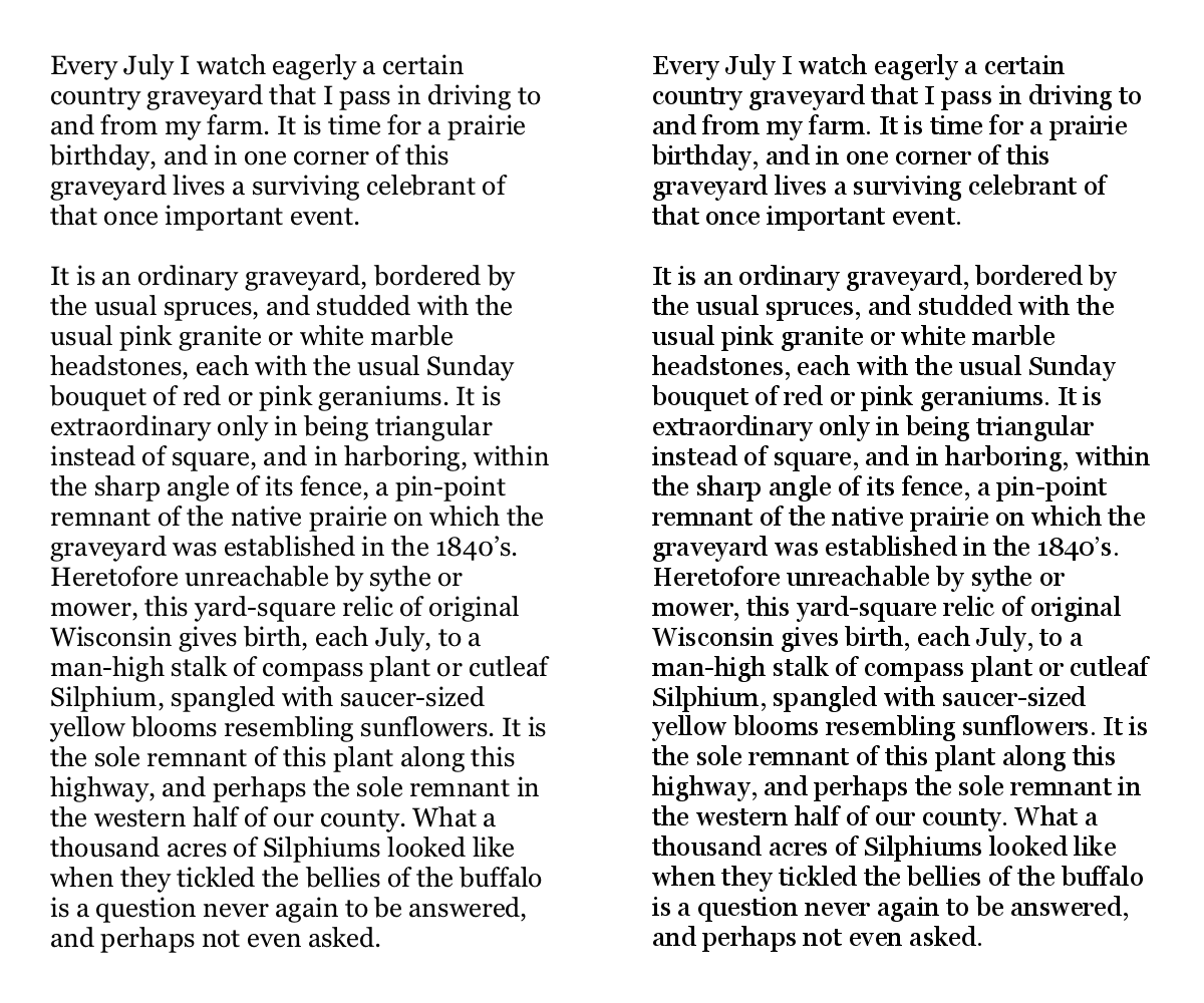
Large text rendering examples.

Figure 6. An animated comparison of large text rendering by Java 6 on Mac OS X and Linux. The magnified text seen in figures 4 and 5 was taken from the two renderings from which this animation was produced, seen here at their original size.

The Original Renderings

If you’d like to see the original renderings from which the magnifications and animations were generated, here they are.

Wednesday, August 18, 2010

Java Text - When Platform Independence Fails

I‘ve recently been working on a Java web application that does server-side rendering of complex graphics that include text. Having sweated all the details to maximize the quality of the application’s output; having finally made the application sufficiently stable and feature-complete to enter beta testing; and having jumped through some unrelated hoops to make the production host usable, I finally found myself at the point where I could deploy the application to its production server.

I thought I was on the brink of success at long last, but when I tried the web application on its production Linux VM, the results were terrible. The text was rendered very differently between Java 1.6 on Mac OS X, which is my development environment, and Java 1.6 on Linux, which is the deployment environment. Specifically, the resolution-independent, anti-aliased, fractional-sized text was rendered beautifully by Java on Mac OS X, and horribly by Java on Linux. You can see for yourself in the examples below. (Due to confidentiality rules, I can’t show the entire rendering, which is unfortunate in this case, because the differences are even more striking when seen en masse.)


Text rendered by Java on Mac OS X, using
“Java(TM) SE Runtime Environment (build 1.6.0_20-b02-279-10M3065)”.


Text rendered by Java on Linux, using
“Java(TM) SE Runtime Environment (build 1.6.0_12-b04)”.


Above, the two samples converted to an animated GIF and perpetually alternating.

Note that in both cases, exactly the same typefaces are being used: Arial (bold and plain) in the yellow area, and Georgia (plain) for the names above. Also in both cases, the rendering was performed in a Graphics2D environment with all of its hints set to maximum quality, and the backing BufferedImage was of the same type (TYPE_INT_RGB). Both systems are even using exactly the same TrueType fonts; I copied them from my Mac to the JRE on the Linux box. Nonetheless, Java’s font rendering under Linux looks like some early, unfinished attempt at supporting TrueType, anti-aliasing and fractional font sizes/metrics. Java on Mac OS X, on the other hand, handles all of the text beautifully.

My best guess is that the results on Linux are representative of the true capabilities of Java's built-in text renderer, while the very different results on Mac OS X are probably due to Apple’s Java engineers substituting OS X’s native font renderer for Java’s. Others seem to have reached similar conclusions in the past.

So, because of these platform dependent text rendering behaviors, I’ve gone from believing that I was ready to deploy an application whose quality was going to reflect well on myself and my organization, while delighting its users, to being so ashamed of the graphics quality that I don’t want to proceed with the deployment; I don’t want to be associated with such poor quality, and I don’t want it being seen as representative of the care that my organization puts into its work.

Arguably, the platform independence was undone by Apple (if the scenario above is correct), but Java’s native text rendering is so bad, I can’t blame them. In fact, I’m glad there’s at least one platform that can run Java and render text well. The real fault seems to be with Sun’s (now Oracle’s) management for not giving Java’s text engine the attention it deserves.

Of course, if anyone knows that I’m wrong about those conclusions, and can show me how to get the same quality of text rendering out of Java on Linux as I get from Java on Mac OS X, I’d be very grateful. And so, I think, would others.

Help if you can, please. Beware of this issue, if you can’t.

Sunday, June 20, 2010

Dear Apple: Typography Still Matters

As others have pointed-out (thanks to Jay Lake for that link), Apple’s ebooks have abandoned good typographic practices, and instead embraced problematic practices like full justification for all text. Apple has now carried these failings over to the generally wonderful “Reader” mode of version 5 of their Safari browser. I’ll confine myself to the issue of full-justification here, and leave the other issues for people who’ve kept their typographic skills more current than my own.

Why is full justification bad? Because the increased space it introduces in text can result in distractingly large gaps between words, and, if some or all of the gaps in one line happen to align with some or all of the gaps in the preceding or following lines, a phenomenon known to typographers as “rivers” is the result – winding vertical columns of white space running through the text. The rivers are not only ugly and distracting, but they ruin the “color” of the text (its consistent grayness when seen from a distance, or with your eyes slightlty defocused.) Typographers don’t let these problems appear in their text, and neither should Apple, inventor of the desktop publishing revolution.

(I was there, by the way, at the beginning of the revolution, replete with my copy of Aldus Page Maker version 1.0, so I remember when typography still mattered to Apple. Even if every other old-timer has gone, Steve Jobs remains, and it is amazing that his justly famous attention to detail allowed these crimes against typography to find their way into released products.)

Steve, Apple, someone – remember when typography mattered at Apple and please make it matter again.

Three “rivers” in less than a paragraph of “Reader” text.
Source: Ars Technica.

No major rivers here, just appalling word spacing (“tracking”).
Source: Wikipedia.

One might attempt to resolve these problems, while clinging to the troublesome practice of fully-justifying text, by increasing the kerning (the space placed between letters) to minimize the tracking. One could even stretch the glyphs of the text a little to reduce the demands on kerning and tacking. However, even in combination, the color of short lines of text will still suffer.

Again, as others have pointed-out, the solution couldn’t be simpler: use left justification (at least by default), and stick to it. (If you must, let users then choose alternate justification schemes – if the lines of text are long enough that full justification can be achieved cleanly, great; if not, let the people who can’t see them have their gaps and rivers.)

C’mon Apple folks, it’s in Apple’s DNA to handle text with the respect that it deserves. Has there been a recent transcription error, or (shudder) was the relevant gene recessive all along? In any case, you can choose to do better now. Honest, you can.