Saturday, August 21, 2010

Video: Bats’ Morning Return to the Bamberger Chiroptorium

I had the opportunity last week to watch the bats return to the Bamberger Ranch Preserve’s chiroptorium. The morning return isn’t as dramatic as the evening emergence, but it’s still something to see. Realizing that, for the first time, I had a device that could capture high definition (720p) video, I propped up my iPhone 4 on the fence at the mouth of the chiroptorium and let it record for about 16 minutes. I’ve edited that recording down to two minutes in the following video. It is best seen at 720p - at lower resolution, the distant bats in the descending stream aren’t visible.

As the bats swooped down and maneuvered aggressively into the cave mouth, they produced a sound that I can best describe as a rapid vibration. My guess is that the trailing edges of their wing membranes vibrate violently during those maneuvers. (Much like the end of a piece of fabric held out of the window of a fast-moving car.) Unfortunately, that sound seems to represent some sort of pathological case for the iPhone 4’s audio capture system, and, as you’ll hear in the movie, it is distorted into something that sounds very much like static. That’s disappointing, but slightly better than no sound at all, I think. So, apologies about the static. It’s not an accurate reproduction of the sound produced by the bats, but its presence and intensity does correlate with the number of bats passing the camera at any given moment, so it has some value.

It is, of course, better to experience this first-hand, but one needs special permission to do so. Being fortunate enough to have that permission, it seems the least I can do to try and share some of that unusual experience. Enjoy.

Thursday, August 19, 2010

Java Text – A Closer Look at the Ugly

Because the failings of the native Java text renderer have had such an adverse impact on my recent work, I think additional examination of the issue is merited. So, to further illustrate the difference between text rendered by Java 6 on Mac OS X and Linux, I’ve taken two paragraphs of text and written a program that fits them on-the-fly into an image of a specified size. Text fitting is vital to the operation of the application from which yesterday’s examples were taken, so it seemed appropriate to create new examples based on text fitting as well.

[By the way, this is in no sense a dig at Linux. I believe the text rendering seen on Linux is representative of Java’s built-in text rendering capabilities, whereas I believe the text rendering seen on Mac OS X is representative of OS X’s native text renderer, which I suspect Apple engineers substituted for Java’s built-in text renderer. Running the code on Linux just happens to let the ugly truth shine through. As with yesterday’s examples, the version of Java used on the Linux box was “Java(TM) SE Runtime Environment (build 1.6.0_12-b04)” and the version on Mac OS X was “Java(TM) SE Runtime Environment (build 1.6.0_20-b02-279-10M3065)”.]

The font used in all cases is Georgia, and the font binary is identical on both installations. The quotation used is from Aldo Leopold’s book A Sand County Almanac, and Sketches Here and There, which I highly recommend. (More of the quote can be found on my page of random Leopold quotes.)

The fitting errors cited below are the difference between the height, in pixels, of the area into which the text was fit, and the actual height of the text. The closer the error is to zero, the better. Considering that the errors are spread over 14 lines of text in the small font example, and 30 lines in the large font example, even the big errors aren’t significant. Nonetheless, the errors consistently show a better fit is achieved when the code is run on Mac OS X, which suggests, at a minimum, the availability of more precise font metrics, and possibly the ability of the font renderer to actually produce (subtly) different glyphs for fonts whose sizes vary by only small fractions of a point.

Small Text Rendering

This is where the difference between Java’s text rendering on Mac OS X and Linux is most obvious. Figure 1 shows a 4X magnification of approximately 12 point text when the Java test program is run on Linux. Figure 2 shows the same magnification of the text produced by the test program when run on Mac OS X. (Figure 3 shows the full renderings at normal size, in an alternating animation.)

The difference in the antialiasing algorithms is striking. In figure 2, Mac OS X shows that antialiasing is applied to every pixel of every glyph, and that the sub-pixel glyph placement this permits allows for more consistent spacing between glyphs (although one can readily find places where either renderer could do a better job of kerning). It also provides for a more consistent “color” (uniform darkness or lightness) of text. Figure 1, by comparison, shows a minimal use of antialiasing, primitive glyph shapes, some highly irregular glyph spacing, and poor color.

An examination with Adobe Photoshop shows only 127 shades of gray are used in the text from which figure 1 was taken. In contrast (no pun intended), the same examination of the text from which figure 2 was taken shows 249 shades of gray are used. So, in this case the default Java font renderer is using half of the available shades of gray to form its glyphs, while the Mac OS X renderer is using almost all of the available shades. That alone gives the Mac OS X renderer almost twice the ability to represent sub-pixel glyph features, an ability of which it seems to take full advantage. Every glyph in these two examples demonstrates this, but, if you want a specific example, take the word “July” on the sixth line. Observe that in figure 1 the bottom of the J’s curve is flat against the baseline (so much for the curve) and very nearly black, while in figure 2 its curve is carefully nuanced right down to two faint gray pixels dropping below the baseline (one is relatively obvious; the other you will probably need further magnification, or a pixel sampler, to see). The descender on the letter “y” is also worth a look. As is plainly visible in figures 4 and 5, that descender is meant to be terminated with a feature similar to a dot. However, in figure 1, there’s no trace of that dot, though it’s clearly present in figure 2.

Another difference in this rendering of small text is most obvious in the figure 3 animation: While the two renderers agree about overall line heights, they disagree on the height of the glyphs by a full pixel. Given that the lines are about 14 pixels high (leading included), that’s a 7% error, though the lack of subtlety in the rendering produced on the Linux machine results in an even greater apparent difference, at least to my eyes.

Next, there’s the matter of large text rendering.


Figure 1. Text rendered by Java 6 on Linux at 11.968737 points
(fitting error: -0.107483), magnified four times.


Figure 2. Text rendered by Java 6 on Mac OS X at 11.944245 points
(fitting error: -0.000177), magnified four times.

Small text rendering examples.

Figure 3. An animated comparison of small text rendering by Java 6 on Mac OS X and Linux. The magnified text seen in figures 1 and 2 was taken from the two renderings from which this animation was produced, seen here at their original size.

Large Text Rendering

The differences between what I’m assuming to be the native Mac OS X text renderer as used by Java 6 on Mac OS X and Java 6’s built-in text renderer, as used on Linux, are less significant at the relatively large font sizes (almost 26.5 points) used in the following figures, but they’re real enough. The figure 6 animation clearly shows many differences in letter spacing, and, while neither renderer is producing ideal results, Mac OS X looks to my eyes to be doing better overall.

Also, the magnifications shown in figures 4 and 5 suggest that, once again, the Java renderer is using fewer shades of gray when it antialiases text than the Mac OS X renderer. And that is, in fact, the case. An examination with Photoshop shows only 123 shades are used in the Java-on-Linux rendering, while the Java-on-Mac-OS-X rendering uses all 256 shades (both numbers include black and white).

Once again, that—and perhaps other failings of the renderer—leads to a lack of subtle detail in the text. Observe that in figure 5 almost every curve or vertical serif that touches the baseline actually extends around half a pixel below it. That doesn’t happen in figure 4. Yet, extending a curve slightly below the baseline is a basic trick of typography – as a curve reaches its bottom it becomes less and less visually significant. If it bottoms-out precisely on the baseline, then it touches the baseline, in principle, at an infinitely small point, and—though an infinitely small point can’t be rendered—the curve nonetheless has reduced contact with the baseline relative to surrounding features that have large areas in contact with the baseline (horizontal serifs, for instance). And that difference in the degree of baseline contact tends to make the glyph with a curved bottom appear to float slightly above the baseline. So, typographers design their fonts to correct for this perceptual error, by dropping the bottom of curves slightly below the baseline. Typographers have a lot of little tricks like that – more, I’m sure, than I’m aware of. And that’s why antialiasing is so important to accurately preserving the look of text on computer displays, at least until our displays exceed something on the order of 300 dots-per-inch of resolution.

The folks behind the text renderer used by Java on Mac OS X clearly demonstrate an understanding of these issues and their importance. There are, nonetheless, strange imperfections in their results, but those seem to stand-out because so much else is done well. The folks responsible for the text renderer used by Java on Linux, which I assume to be Java’s native text renderer, don’t seem to care about these issues. Or, if this article is correct (and I have no reason to doubt it), the Java text engineers get it, but their management doesn’t. (Or it hasn’t – we’ll see if the new Oracle management is any better than the old Sun management, though I see no reason for optimism.) Thus, not only the subtle aspects of the art of typography—those that bend type around the particulars of human perception—but the grossest qualities of glyph formation and spacing are … well, I struggle for the right word. “Trashed,” isn’t quite it, but it’s in the correct neighborhood. And that neighborhood should also include either a pervasive failure of perception, or a cretinous disregard for the quality of what one perceives. Maybe both.


Figure 4. Text rendered by Java 6 on Linux at 26.406231 points
(fitting error: -0.957642), magnified four times.


Figure 5. Text rendered by Java 6 on Mac OS X at 26.403095 points
(fitting error: 0.000000), magnified four times.
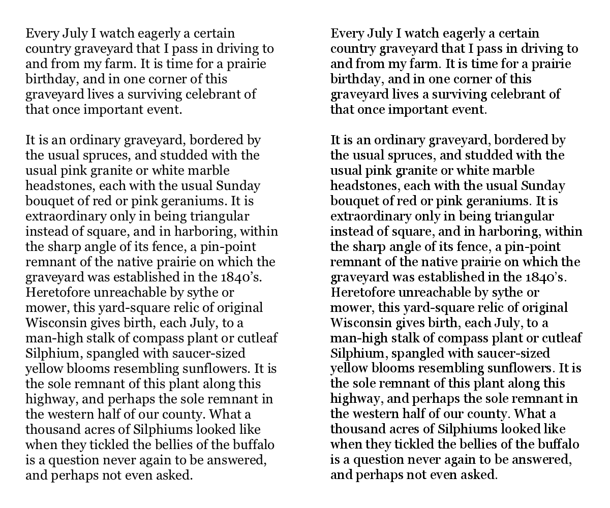
Large text rendering examples.

Figure 6. An animated comparison of large text rendering by Java 6 on Mac OS X and Linux. The magnified text seen in figures 4 and 5 was taken from the two renderings from which this animation was produced, seen here at their original size.

The Original Renderings

If you’d like to see the original renderings from which the magnifications and animations were generated, here they are.

Wednesday, August 18, 2010

Java Text - When Platform Independence Fails

I‘ve recently been working on a Java web application that does server-side rendering of complex graphics that include text. Having sweated all the details to maximize the quality of the application’s output; having finally made the application sufficiently stable and feature-complete to enter beta testing; and having jumped through some unrelated hoops to make the production host usable, I finally found myself at the point where I could deploy the application to its production server.

I thought I was on the brink of success at long last, but when I tried the web application on its production Linux VM, the results were terrible. The text was rendered very differently between Java 1.6 on Mac OS X, which is my development environment, and Java 1.6 on Linux, which is the deployment environment. Specifically, the resolution-independent, anti-aliased, fractional-sized text was rendered beautifully by Java on Mac OS X, and horribly by Java on Linux. You can see for yourself in the examples below. (Due to confidentiality rules, I can’t show the entire rendering, which is unfortunate in this case, because the differences are even more striking when seen en masse.)


Text rendered by Java on Mac OS X, using
“Java(TM) SE Runtime Environment (build 1.6.0_20-b02-279-10M3065)”.


Text rendered by Java on Linux, using
“Java(TM) SE Runtime Environment (build 1.6.0_12-b04)”.


Above, the two samples converted to an animated GIF and perpetually alternating.

Note that in both cases, exactly the same typefaces are being used: Arial (bold and plain) in the yellow area, and Georgia (plain) for the names above. Also in both cases, the rendering was performed in a Graphics2D environment with all of its hints set to maximum quality, and the backing BufferedImage was of the same type (TYPE_INT_RGB). Both systems are even using exactly the same TrueType fonts; I copied them from my Mac to the JRE on the Linux box. Nonetheless, Java’s font rendering under Linux looks like some early, unfinished attempt at supporting TrueType, anti-aliasing and fractional font sizes/metrics. Java on Mac OS X, on the other hand, handles all of the text beautifully.

My best guess is that the results on Linux are representative of the true capabilities of Java's built-in text renderer, while the very different results on Mac OS X are probably due to Apple’s Java engineers substituting OS X’s native font renderer for Java’s. Others seem to have reached similar conclusions in the past.

So, because of these platform dependent text rendering behaviors, I’ve gone from believing that I was ready to deploy an application whose quality was going to reflect well on myself and my organization, while delighting its users, to being so ashamed of the graphics quality that I don’t want to proceed with the deployment; I don’t want to be associated with such poor quality, and I don’t want it being seen as representative of the care that my organization puts into its work.

Arguably, the platform independence was undone by Apple (if the scenario above is correct), but Java’s native text rendering is so bad, I can’t blame them. In fact, I’m glad there’s at least one platform that can run Java and render text well. The real fault seems to be with Sun’s (now Oracle’s) management for not giving Java’s text engine the attention it deserves.

Of course, if anyone knows that I’m wrong about those conclusions, and can show me how to get the same quality of text rendering out of Java on Linux as I get from Java on Mac OS X, I’d be very grateful. And so, I think, would others.

Help if you can, please. Beware of this issue, if you can’t.

Thursday, July 15, 2010

Stephen Wolfram discusses “Computation and the Future of the Human Condition”

As found on the Wolfram Blog, Stephen Wolfram provides a transcript of his talk “Computation and the Future of the Human Condition” delivered at the H+ Summit @ Harvard on June 12, 2010. I found it interesting. Unfortunately for me, just as when I read his book A New Kind of Science (NKS), I think I can grasp the general ideas, but I can’t make the intellectual leap necessary to understand how to apply them to solving problems. I think I can see some of the outlines of what may be involved, but the full outline, and the all-important details of implementation remain beyond my reach. Frustrating.

Below is a brief excerpt dealing with ideas he’s discussed at length elsewhere, so it may not be the best choice of an excerpt. On the other hand, it may be good for piquing the curiosity of those without much exposure to Wolfram’s thinking.

[...T]o make a prediction, we have to be able to somehow out-compute the system that we're trying to predict.

Well, for systems like idealized planets orbiting a star, that's always been possible.

We don't have to trace every point in each orbit; we can just have a little computation that jumps immediately to the answer.

In effect, we can computationally reduce the behavior of the system.

But will that always be possible?

The Principle of Computational Equivalence implies that it won't.

And in fact it implies that even among very simple programs in the computational universe, it's common to find computational irreducibility.

The exact sciences have always avoided systems that work like this.

But they're all over the place.

We've always implicitly assumed for our science that we as observers or predictors of systems are much more computationally sophisticated than the systems we're observing or predicting.

But the Principle of Computational Equivalence says that this isn't true.

And that instead we are just equivalent to the systems.

So that we can never expect to outrun them.

And to find out what they do we have no choice but to simulate each step in their behavior, or in effect just to watch how the behavior unfolds.

Wednesday, July 14, 2010

“Rotating Spiral” becomes a Google “Chrome Experiment”

My combination of Javascript and SVG that produces a rotating spiral graphic (“you are getting sleepy... very sleepy”) has been accepted by Google as an official “Chrome Experiment.” You can find the Chrome Experiments main page at http://www.chromeexperiments.com/, and my spiral experiment at http://www.chromeexperiments.com/detail/rotating-spiral/.

I’ve also submitted several other of my Javascript/SVG experiments. I thought the rotating spiral was the weakest of them, so I was surprised, but pleased, when it was accepted. Hopefully, some or all of the others will ultimately be accepted as well. And, for anyone who doesn’t want to wait, you can find all of my experiments on my Automatons page – with one notable exception: my MazeWars SVG game. Unfortunately, it can’t be run as a stand-alone application – it requires someone to setup a game server.

Thursday, July 8, 2010

Gus Grissom Gets His Way

From Rockets, Missiles, and Men in Space by Willy Ley, 1968 edition, pg. 390:

Except for GT-III the Gemini spacecraft were not given names as the Mercury capsules had been. GT-III did have a name; it was called the Molly Brown. The name was chosen by the command pilot of the flight, Virgil Ivan Grissom. Grissom (generally known as “Gus”) had had to swim to safety when his Mercury capsule Liberty Bell 7 sank after the second suborbital flight. At the time GT-III was being readied, there was a successful musical show on Broadway called The Unsinkable Molly Brown, and Grissom had decided that if a name could help to keep his second capsule afloat that would be the one. NASA officials were a bit reluctant to accept “Molly Brown” but when Grissom suggested “Titanic” as his alternative choice they gave in.

Sunday, July 4, 2010

Government Secrecy, Andrew Jackson Style

Here’s a dose of perspective on government secrecy for this July 4th. I don’t mean to suggest that today our government can be as open as it was in Andrew Jackson’s (or Lincoln’s) time, but the following provides some perspective on how much the openness of our American government has decreased over the course of the past 150 years. To be sure, we’ve added some improvements, like the Freedom of Information Act, but, as we saw during the Bush administration, the various organs of our government have, or can take, far too much leeway in their interpretations of their obligations under that act. And, more generally speaking, because an informed electorate is critical to the success of a democracy, the less an electorate knows about the activities of its government, the less durable their democracy becomes.

From Secrecy by Daniel Patrick Moynihan, pp. 82-83:

Openness in deliberation and not least in diplomacy came to be seen as something of a democratic virtue, even an aspect of [American] national character. In 1860, one of Andrew Jackson’s early biographers reported an anecdote that cast the general as the very embodiment of this virtue. When Jackson was told that one Augustus, a servant with the run of the White House, might be smuggling presidential papers to the general’s opponents, Jackson responded:

“They are welcome, sir, to anything they can get out of my papers. They will find there, among other things, false grammar and bad spelling; but they are welcome to it all, grammar and spelling included. Let them make the most of it. Our government, sir, is founded upon the intelligence of the people; it has no other basis; upon their capacity to arrive at right conclusions in regard to measures and in regard to men; and I am not afraid of their failing to do so from any use that can be made of any thing that can be got out of my papers.”

Apocryphal or not, the anecdote bespeaks what appears to have been a widely shared sentiment. Then with the onset of the Civil War we observe the surely unprecedented notion of openness as an instrument of foreign policy. On December 3,1861, at the beginning of the second session of the Thirty-Seventh Congress, Abraham Lincoln accompanied his State of the Union message with 410 pages, all promptly printed, of dispatches to American ministers abroad. The dispatches dealt with the Confederate states’ efforts to obtain recognition from foreign powers, notably Spain, France, and Great Britain. It was a fateful enterprise in which assertive openness was considered the most effective policy, and there is reason to judge that this proved to be the case. Openness communicated our threats as well as our entreaties, and it did so, in the case of Britain, not only to Whitehall but also to an increasingly literate and volatile public. The United States was dealing with insurrection at home; did Her Majesty’s Government, did the British people consider that this same misfortune might befall England, or Ireland?